Cerberus A few simple, but solid patterns for responsive HTML emails. Even in Outlook and Gmail.

Cerberus -
Between mobile, Gmail, and Outlook, HTML email is a three-headed dog from hell.
Coding regular emails is hard enough by itself. Making them responsive shouldn't add to the headache. A few simple, but solid patterns are all that's needed to optimize emails for small screens.
That's what Cerberus is.
It's just a few responsive email patterns that go a long way. The code blocks are compartmentalized so that they may be used, combined, and nested to build an email.
Each template is annotated and has good support among popular email clients.
I wrote a blog post that goes into more detail on why I made this in the first place. Cerberus is Responsive Email XX's successor.
 As the layout narrows, the email content reflows and resizes gracefully.
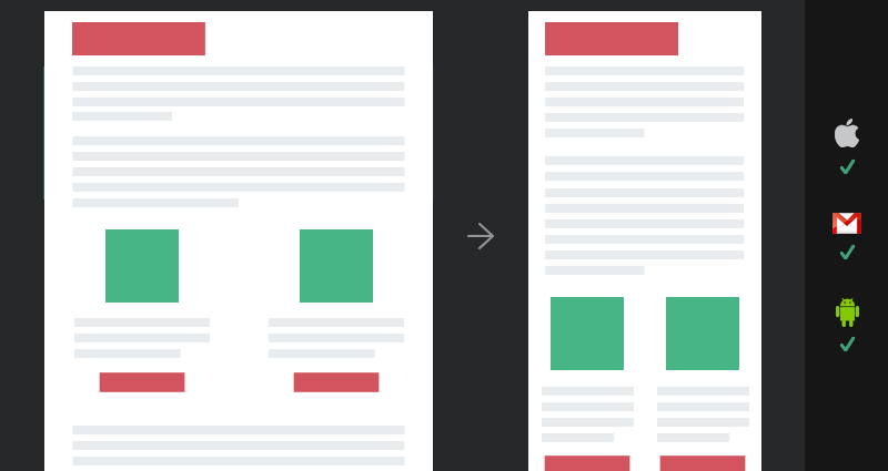
Good for simple layouts such as transactional and single column emails.
This template focuses on a fluid layout that sizes itself using percentage-based widths to shrink horizontally on narrow screens. This email layout does not reconfigure at different screen sizes.
If you want a basic template to handle rich text and images, this is a good baseline.
 The email layout changes at breakpoints using media queries.
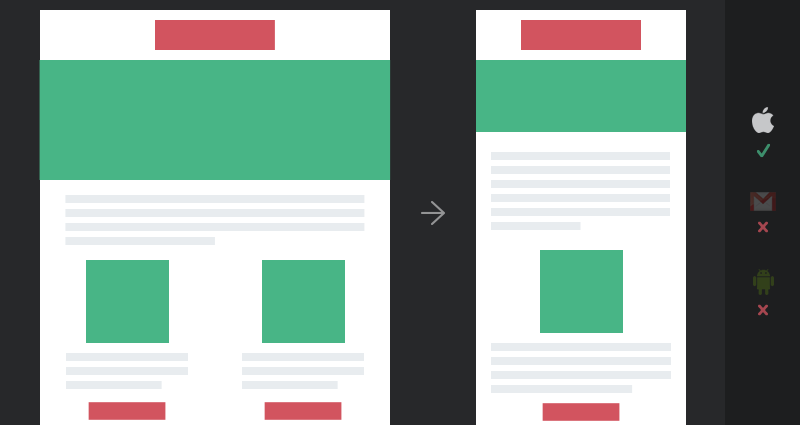
Good for more complicated, shape-shifting email layouts that work on some mobile clients.
This template uses media queries to reconfigure the layout for different screen sizes for email clients that support media queries. However, mobile clients that don’t support media queries or the <style> tag will display a shrunk version of the desktop layout instead. This applies to Gmail, Inbox, and some Android 4.* Mail clients (bigger list).
If you’re already comfortable with media queries, the learning curve is relatively low. If total device coverage isn’t required, you can create a responsive email the same way you create a responsive website.
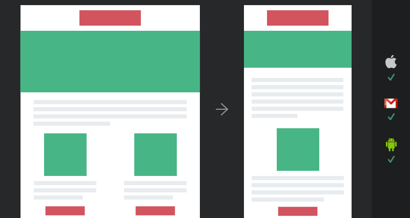 The email layout stacks without media queries.
This template uses a hybrid approach to reconfigure the layout for different screen sizes for email clients regardless of media query support. At its core, it uses max-width and min-width to impose rigid baselines (allowing some movement) and imposes a fixed, wide width for Outlook who is shackled to desktop anyway. Once a mobile-friendly baseline is set, media queries progressively enhance the email further in clients that support it.
If you have some email design experience, this template optimizes every popular email client. All the extra Outlook and Gmail code can make these templates quite large and your maths have to be spot on for multi-column layouts.
Cerberus is tested in the most popular email clients as reported by Litmus and my own email campaigns. I've focused on the following clients:
When I say “tested”, I mean “email doesn’t fall apart”. I don't mean “I found a way to make media queries work in Gmail” or "Everything is pixel perfect in Outlook."
Any client not listed above should be considered untested. If you feel I’ve left out a popular email client or can suggest a non-destabilizing fix for one, please submit an issue!
For what it's worth, Litmus (who DOES test every email client out there) chose to include these templates in its Email Builder, so there’s that.
If you would like to help, please @reply me on Twitter or open an issue to discuss your idea. I'm forever interested in reducing the entropy of this code.
Hi there, I’m Ted Goas, the core author and maintainer. I'm a designer & front-end developer working on websites, web apps, and HTML emails. And I enjoy talking shop on Twitter.